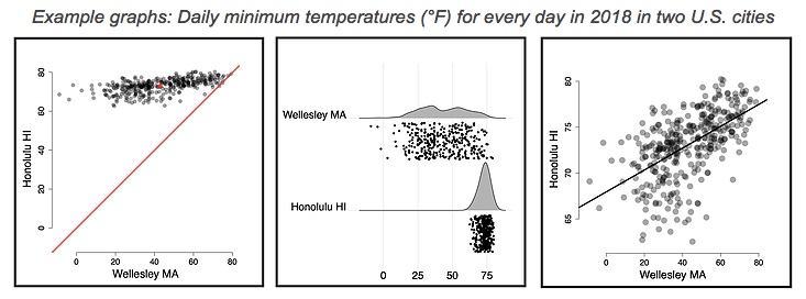
The aim of the Show My Data project is to empower users to transform data into knowledge, whether those data are from themselves, a class, the workplace, a research project, the web, or the world. A suite of simple, elegant, powerful, best practice data visualization tools are available as free, easy-to-use web apps. Creating a visualization is as easy as copy-and-pasting the data and adjusting the look and feel via a simple user interface. High-resolution visualizations can be downloaded for presentations and publications. The design of the visualization tools embodies a core principle, “Show the data (all of it) … Because the clearest thinking and the deepest insights must inevitably come from seeing what is really there.” Separate apps compare and contrast different groups of individuals or measurements (histograms, independent groups), correlate different measurements taken from the same individuals, and compare and contrast different measurements taken from the same individuals (repeated measures). These tools are continually evolving.


